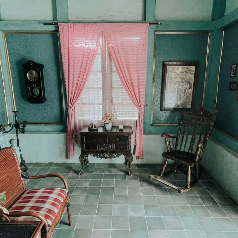
Choosing Colors for Your Cottagecore Home
There is a quiet magic in the colors that surround us: the way they shape the air of a room, the mood of a morning, the feeling of home. In a cottagecore dwelling, color is never loud or harsh, but soft, sun-warmed, and steeped in the hues of the natural world. It whispers of wildflower meadows, aged parchment, and the patina of well-loved things. Choosing the right palette is like weaving a spell: one that invites peace, nostalgia, and the gentle embrace of simpler times.
Earth Beneath Your Feet
Grounding Neutrals
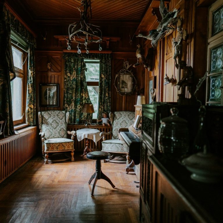
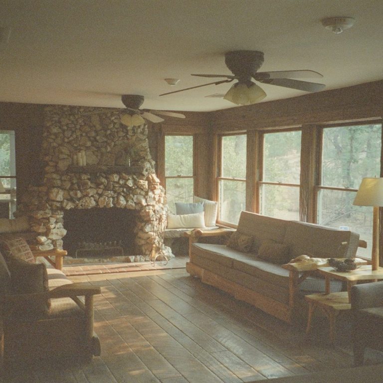
Every cottagecore home begins with a foundation of earthy neutrals, colors that feel as though they’ve been pulled straight from the forest floor. Think of warm, creamy whites like fresh milk or unbleached linen, soft beiges reminiscent of sunbaked stone, and muted taupes that echo the furrows of a plowed field. These are the walls that hold your stories, the backdrop to a life well-lived.
Deeper neutrals (oatmeal, toasted wheat, and the gray-brown of weathered wood) add warmth without weight. They’re the colors of a well-worn apron, a basket of gathered twigs, a shelf of old books. They don’t demand attention but reward it, offering a sense of stability, of roots.
The Garden Indoors
Gentle Greens
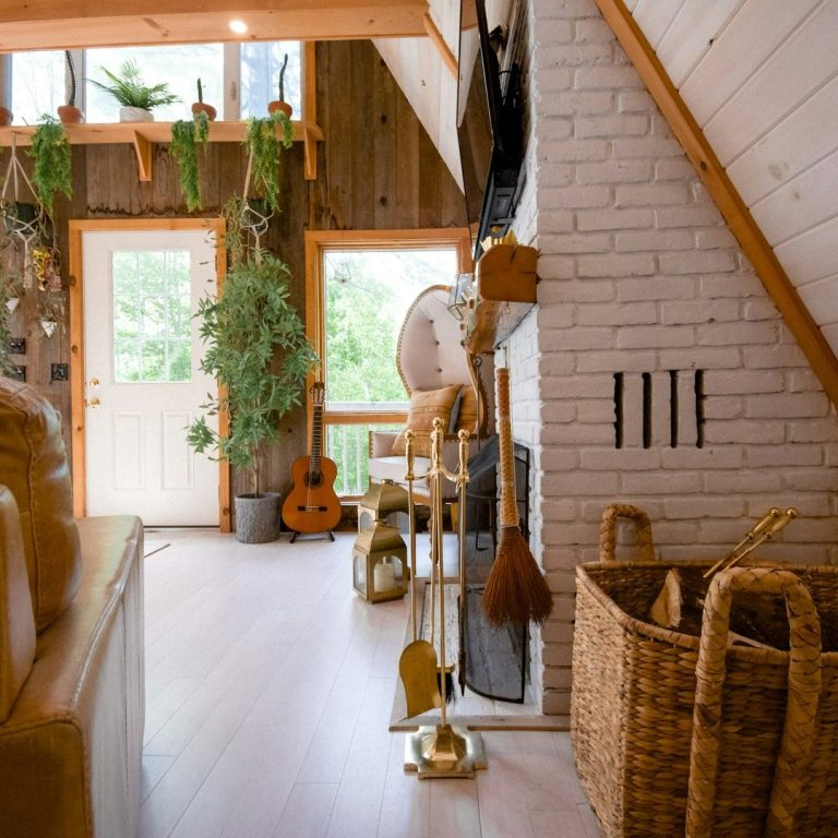
What is a cottage without the whisper of leaves? Soft, dusty greens (sage, moss, eucalyptus) bring the outside in, turning a room into a sun-dappled glade. These are the colors of herb bundles drying in the kitchen, of ivy trailing across windowsills, of linen curtains fluttering in a spring breeze.
For those who crave a touch of bloom, faded floral hues nod to vintage teacups and heirloom roses. Blush pinks, like the inside of a seashell; buttery yellows, shy as primroses; and lavender so pale it’s nearly a memory. These aren’t the bright, bold shades of modern decor, but the delicate tints of petals pressed between the pages of a book.
Hearth’s Warmth
Rich, Smoky Accents
Just as a fire lends its glow to a room, deeper tones add depth and comfort. Terracotta, like sunbaked clay; ochre, golden as honey in light; and burnt umber, the color of autumn leaves crushed underfoot. These are the shades that gather you in, that make a home feel lived-in and loved.
In textiles (a knitted throw, a braided rug, a quilt stitched by hand) these warm accents feel like an embrace. They pair beautifully with creamy whites and soft greens, creating a space that’s neither too heavy nor too faint, but perfectly balanced, like a cup of tea with just the right amount of milk.
Sky and Sea
Soft Blues and Weathered Grays
Not all cottagecore colors are warm. Some carry the quiet coolness of early mornings: the pale blue of washed linen, the misty gray of a rainy dawn, the faded denim of a well-loved apron. These hues bring airiness, lightness, a sense of calm. They’re perfect for bedrooms, where sleep should come as easily as a sigh, or for kitchens where the light slants in like a blessing.
Weathered wood, pewter, and iron accents add a touch of timeworn charm. These aren’t the harsh metals of industry, but the softened edges of things that have been used, cherished, and passed down.
The Art of Fading: Imperfect, Worn, and Loved
Cottagecore colors are never too new, too sharp, or too perfect. They’re faded by sunlight, softened by time, and layered like the pages of a diary. Paint chips gently; fabrics fray at the edges; wood darkens with age. This is the beauty of it, the sense that these colors have lived, just as you have.
When choosing your palette, ask: Does this feel like a memory? Like something that has been here all along? The right colors don’t shout; they hum. They don’t startle; they soothe. They turn a house into a home, a room into a refuge, a wall into a story.
So dip your brush, choose your cloth, and let the colors of the countryside guide you. Your home should be a canvas of comfort: a place where every shade feels like a deep breath, a held hand, a moment of quiet joy. After all, the best colors are the ones that make you feel, unmistakably, at peace.